Color coordination should never be overlooked by the man building a wardrobe.
Chosen colors are like a proper fit – a detail that can entirely make or break an outfit.
Very nice clothing in the wrong color combinations will still make you look bland and boring, or loud and foolish.
Finding a happy medium is essential to developing the look men strive for.
In this article, we explain how to combine color combinations in your wardrobe using the color wheel.
You will learn:
- What Is The Meaning Of The Color Wheel?
- What Are The 3 True Primary Colors?
- What Are The 3 Secondary Colors?
- What are the 6 Intermediate Tertiary Colors?
- How Do Men Combine Clothing Colors?
- What Does The Color Wheel Teach Us?

What Is The Meaning Of The Color Wheel?
The Color Wheel, which was developed by Sir Isaac Newton in 1666, is the basis for all color theory. The 12 basic colors are called ‘hues'.
Most clothing comes in a more muted form of the true hues – either they are lightened by adding white (called a ‘tint') or darkened by adding black (a ‘shade').

Any outfit will be a combination of these colors and the ‘neutrals' – white, black, and the two combined to make grays of varying darkness. Brown is sometimes described as a ‘neutral' base for an outfit as well, but it is still a combination of color wheel hues, and usually reads closest to orange or red-orange in outfits.
Understanding which relationships on the color wheel look “good” to human eyes and which seem bland or garish is the key to using the color wheel in coordinating your outfits.
What Are The 3 True Primary Colors?
- Red
- Yellow
- Blue
These are the only colors that can't be made by adding or mixing other colors together. All the other hues can be created by combining primary colors.
In their natural hue (without shading or tinting), they read as very bright, vivid colors to the human eye.
You use them when you want to grab the viewer's eye. As a result, you'll usually only see small accents in unaltered primary colors such as a red tie or a yellow pocket square.
What Are The 3 Secondary Colors?
- Green
- Orange
- Violet

These are each created by combining two primary colors – red and blue to make violet, yellow, and blue to make green, and red and yellow to make orange.
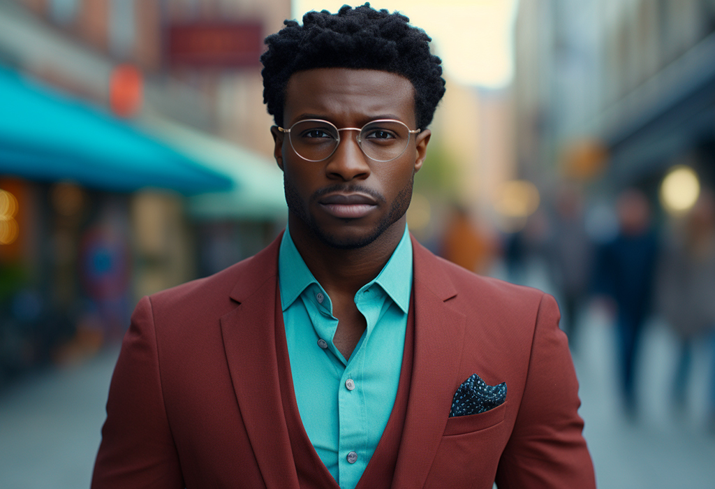
Each secondary color is directly opposite a primary color on the wheel. That relationship is called “complementary.”
Human eyes notice the contrast between complementary colors more than other combinations. A complementing outfit will always read as bright and attention-getting.
As a result, many outfits combine a primary color (usually a shade or a tint of one) and a secondary color for the basic contrast.
What are the 6 Intermediate Tertiary Colors?
- Yellow Orange
- Red Orange
- Red Violet
- Blue Violet
- Blue Green
- Yellow Green
These are found between the primary and secondary colors. It's important to remember that they are distinct hues and not just shades or tints of the primaries and secondaries – a violet shirt isn't the same thing as a the deeper blue-violet.
It's a different color rather than a darker form of the same color, with a different complementary color on the other side of the wheel and so on.
Treating the intermediate colors as their own distinct hues will make a serious improvement in your understanding of your wardrobe colors.


")


How Do Men Combine Clothing Colors?
Mixing colors is an essential skill for any man who hopes to dress well. Mixing colors can create two effects – harmony or disorganization. When we mix colors in an outfit, we want to use colors that work with each other to create an appearance that's pleasant to look at, not a mash of color that looks chaotic.
If we don't mix colors or use any variety, the end result will most likely be bland or boring, which people don't want to look at. If we mix too many colors or mix colors in a non-harmonious way, it leads to a chaotic and disorganized appearance.
This is why it is essential to know what color combinations work well together.
There are three color schemes that register as the most organized with human eyes – complementary colors, triad colors, and analogous colors.
It's most common to see a complementing color scheme on someone who needs strong contrast to stand out.
TV commentators like complementing colors since television has a hard time projecting closely-related colors without turning washed-out.
A small accent in a complementary color is a great touch on a suit or sport coat — pocket squares and boutonnieres in complementary colors always make an attention-getting splash of color.
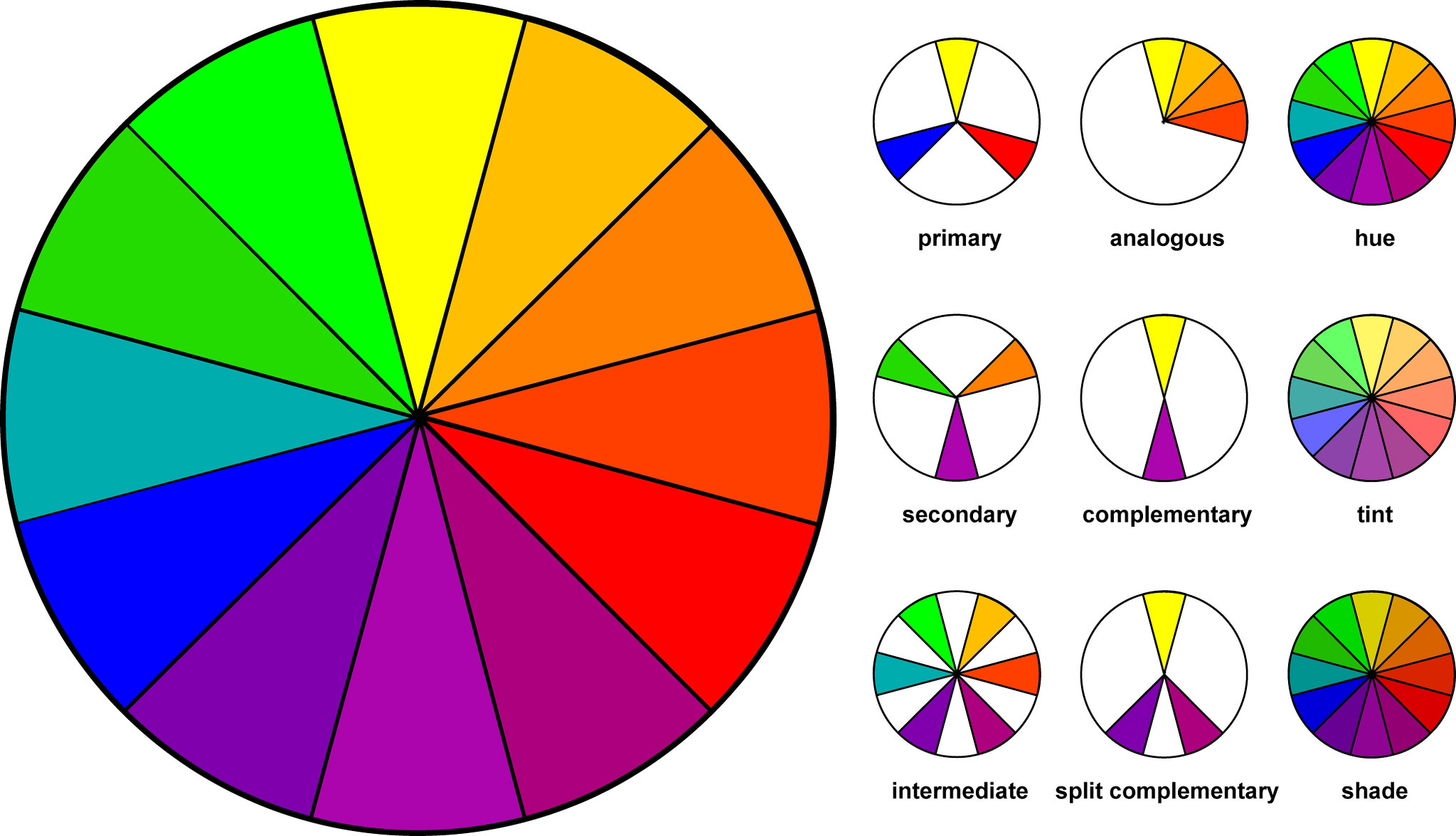
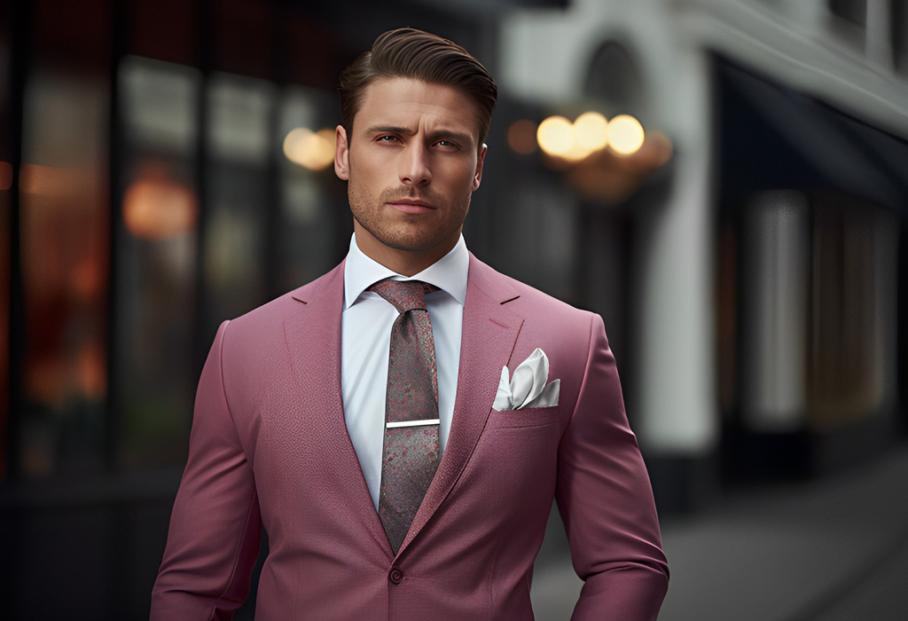
- Triad Colors are equidistant from one another on the color wheel. This creates the most balanced form of contrast.
Triad colors are a good scheme for an outfit with lots of pieces. A man trying to balance a suit, shirt, tie, belt, shoes, cufflinks, etc. might want to be thinking in terms of triads.
Some accents in neutral colors, such as black shoes and a black belt, will of course work with any color scheme.
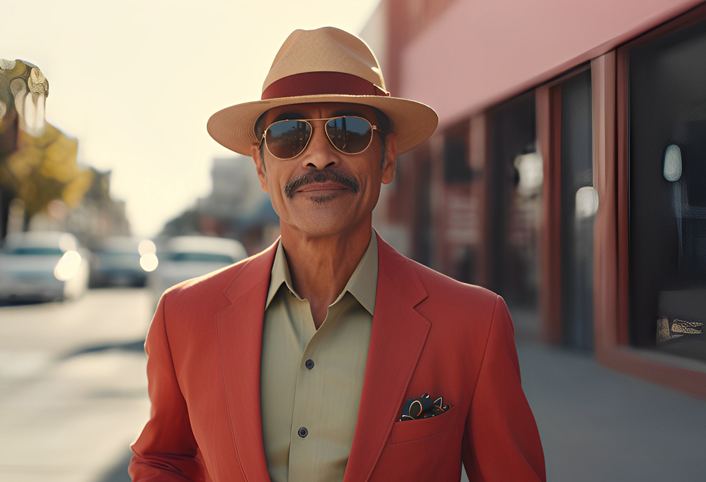
- Analogous Colors are directly adjacent on the color wheel. This creates a minimized contrast, giving a very consistent look. Analogous color schemes are great for looking a little more restrained.
They make good office outfits. Some fancy occasions also call for analogous color schemes, such as a wedding party with a unified color scheme, but be aware that fancy isn't the same as formal. For that, you'll still need a standard black tie ensemble, which uses very little color at all.
For a detailed understanding of men's dress codes – read our Men's Dress Code Guide.
What Does The Color Wheel Teach Us?

The relationship between colors is a science – you can get advanced degrees in it. Don't let that intimidate you. The three basic relationships outlined above are always good staples for your wardrobe.
And remember that you also have tints and shades to play with – a deep burgundy shirt reads just the same as a vivid red one for purposes of contrast and relationships on the color wheel, even though it appears much more restrained (and more socially acceptable) in outfits.
Not all your outfits will follow the color wheel relationships rigidly.
Don't worry too much if they don't. Look for combinations that you feel comfortable in, using the color wheel schemes as a very basic guideline. A splash of difference here or there is what makes the outfit yours.
So there you have it. In this article, we've outlined the basic theory that underlies all the color decisions you can make in your wardrobe.
Hungry for more? Read our article on A Man's Introduction to Color.
Click below to watch the video – A Man's Guide To Color -10 Tips To Better Leverage Color In Your Wardrobe:
Listen to the podcast – A Man’s Guide to Integrating Color in a Wardrobe